How to talk to your designer
The secret to getting the very best graphics for your business is learning a bit of the lingo that goes with design. The better educated you are, the better the results will be. Use this as a beginner’s guide. We’ll be adding to it periodically, so check back.
TRIM, BLEED, and MARGIN
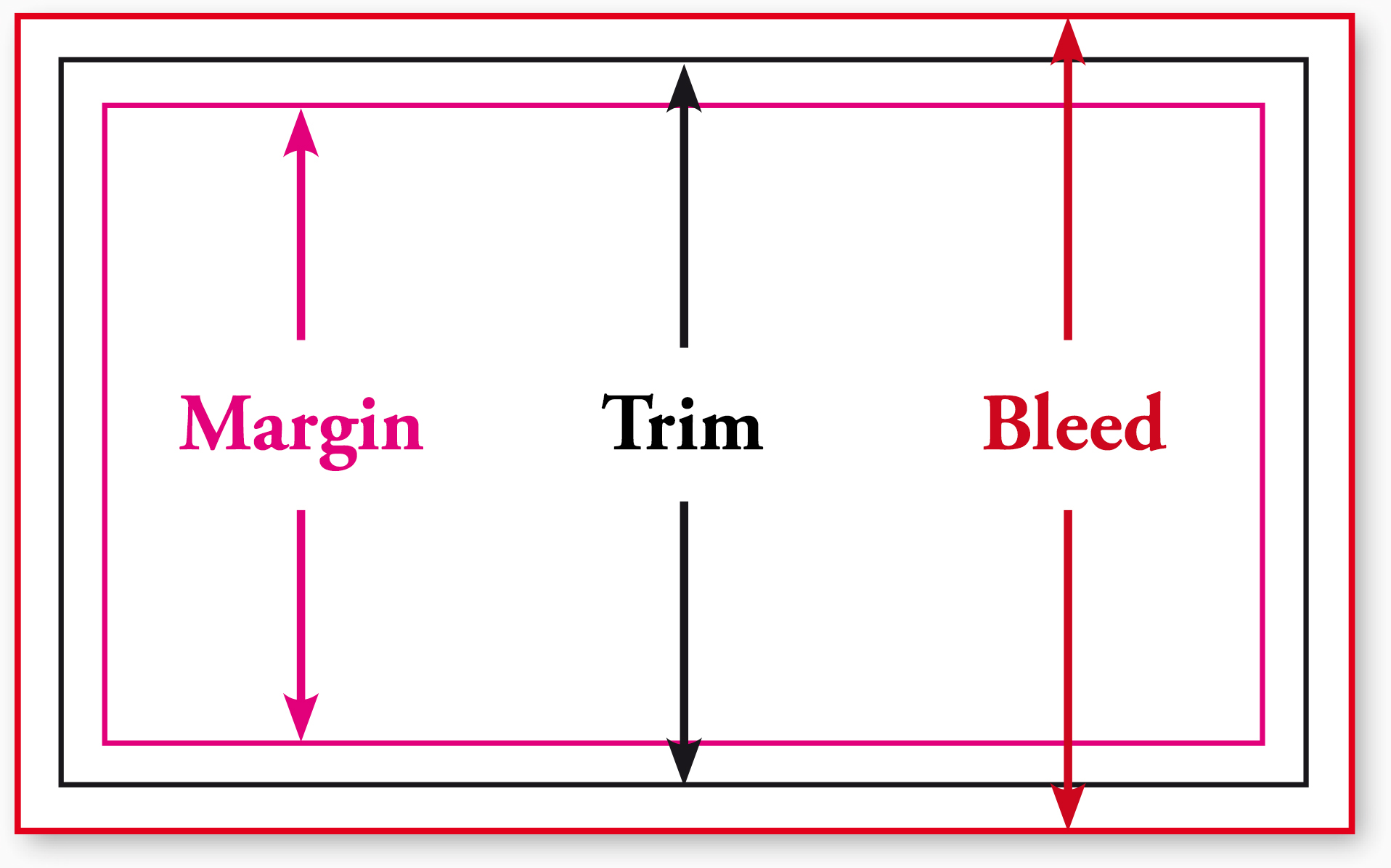
It’s been said that trim, bleed, and margin are the most important aspects of printing instructions. Everything else is either technical instruction or adjustments for quality.
Trim is where the product will be cut (or trimmed).
Bleed (short for full bleed margin) is a safe zone for printing outside the trim area. Suppose you want no margin between the trim and the edge of the artwork. Because printing can be a somewhat imprecise mechanical process, the only way to achieve this reliably is to print past the place you want to cut. Otherwise you’d have a thin white line between your artwork and the edge of the page.
Margin (also called a safety, safety zone, or safety margin) is the area on the design where graphics and text are safe from being cut off by the trim. Mechanical printing is still a process with a margin of error (no pun intended), so the margin ensures that no content will be cut off.
CLEAN COPY
If you’re providing copy (aka writing of any kind) to your print designer, you’ll want to provide clean copy in electronic form, such as a Microsoft Word document.
In the graphic design world, clean copy means final copy — free of typos and editing notations, as well as punctuated correctly. Clean copy also means copy as free of formatting (e.g., different sizes, bolding, and italics) as possible.
In other words, don’t format:
- the heads (titles) and subheads
- indentations
- tabs
- lists
After your first design proof, you’ll have a chance to format your copy, proofreading against your original copy.
Why is clean copy important? Formatting created in word processors such as Microsoft Word can conflict with design applications like Adobe InDesign. Better to leave the designing to your graphic designers. That is what you paid them for, right?
DISPLAY VS. BODY TYPE
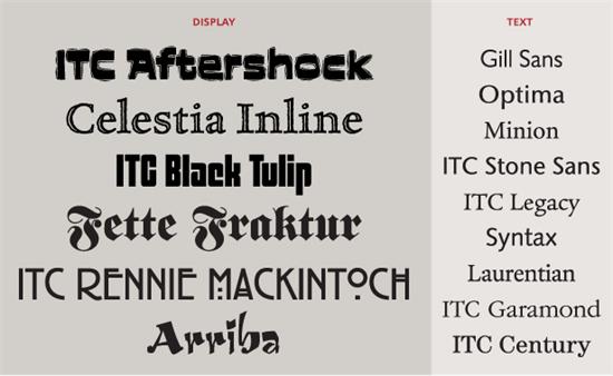
Display type is any type used as a head or subhead. Body type refers to the text that falls under a head or subhead. Body type includes sentences and lists. Here's a great article from fonts.com about it.
Display type is usually a different typeface from its accompanying body type.
Also, the readability of display and body type varies across media. What’s readable on a printed page (say, a book) would usually require a serif typeface (see below), generally black text against a white page. On a web page, readers still prefer dark text on a light page, but find sans serif body type more legible.
LOREM IPSUM
Lorem ipsum (derived from the Latin dolorem ipsum, or “pain itself”) is filler text used by designers to create a clean design. By using placeholder text, the designers and their clients can focus on page layout, font choice, and other design decisions without being distracted by content.

Fun fact: Often called greeking, the lorem ipsum text most commonly used today is a scrambled passage from De minibus bonorum et malorum, a first century BCE Latin text by Cicero. A variation of the text has been used since the 1960s but became widespread in the 1980s when the Aldus Corporation introduced the first professional design program, PageMaker.
If you need some lorem ipsum you can generate it here at the Designer’s Toolbox.
RASTER V. VECTOR IMAGES

Briefly put, raster images are comprised of pixels. Vector images are mathematical calculations.
What does this mean for you? Raster images are exactly the size originally created. A raster image can be made smaller, but not larger. Vector images can be resized to any size at all.
So why wouldn’t you want all of your images handled in a vector application such as Adobe Illustrator? Easy—you can create rich and detailed images with raster graphics.
Theoretically, every pixel in an image (such as a photograph) can be a different color. Also, almost any application can work with a raster file. One of the most popular, Adobe Photoshop, also makes creating .jpgs, .gifs, .pngs and other formats really easy.
Ideally, you want your corporate identity graphics created in a vector application such as Adobe Illustrator, so that you can resize them when needed for banners, billboards, and virtually any other use.
Raster images can be converted to vector images, but it’s really better and cheaper to have your artwork created right the first time.
SERIF AND SANS SERIF TYPE
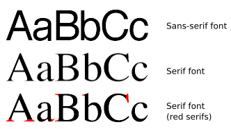
The short definition of serif type is that it has a horizontal stroke at the base and tops of certain letters. For hundreds of years, serif typography was the only typography. It wasn’t until the 19th century that sans serif (literally, without footer) became widespread.
Perhaps the best-known serif typeface is Helvetica, although there are thousands to choose from.