Storytelling and The Nightmare Before Christmas

“Every story has a beginning, a middle, and an end. Not necessarily in that order.” - Tim Burton

No matter the order, quality storytelling pulls you in and immerses you in the design being created around you. From digital to visual storytelling each follows five fundamental elements which we’ll explore the Halloween classic The Nightmare Before Christmas.

With our first panorama of the forest, the scene is set for worlds beyond our own. Worlds that live hidden behind holiday themed doors. The music creates an air of intrigue as the narrator's voice booms in beckoning us through the door into Halloween Town. The screen engulfs in black, aside from a lone jack-o-lantern, and the chords for "This Is Halloween", The Nightmare Before Christmas' signature song begins. We fall into the setting and become part of a world that reveals its cast of characters with each cheer of “This is Halloween”.

As subplots unfold around us, we plunge deeper into the world of Halloween Town and are invited into the heart of the undead Jack Skeleton.  We’re no longer spectators to a story being told by an unseen narrator. Instead, we're a living extension of the feelings invoked by the cast of characters as they effortlessly create the mood of the story through their heartfelt soliloquies and interpersonal dramas. We become invisible as we entangle with the story. Jack’s first time in Christmas Town becomes our first time as the emotions overtake us we feel his joy, curiosity, and desire.

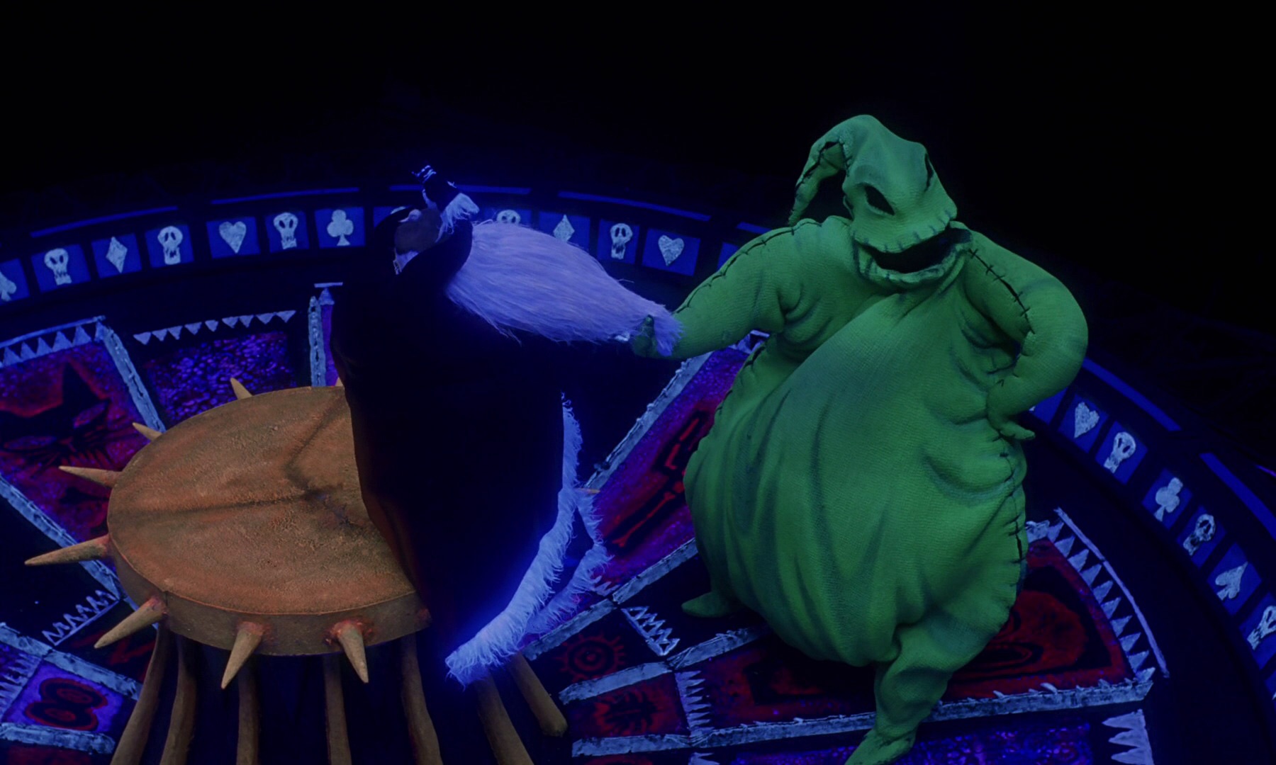
The subplots move along in conjunction with the central plot, a mirrored dance of emotions, we relate to Sally’s need to be heard and free along with Jack's need to meaning in his work. When Christmas night approaches we fear for Jack, Santa, and the unsuspecting residents of Christmas Town. The story moves along with the grace of a seasoned gravedigger, digging us deeper into the world crafted by Tim Burton. With each roll of his dice, Oggie Boogie becomes the embodiment of all of our nightmares.

All hope seems lost for these characters we've become invested in. Our hearts sneak at the thought of losing Jack and Santa in one evening. Until the mood is reversed, and Jack is revealed dangling in a cemetery experiencing a moment of clarity and victory we all can relate to in some fashion. Having finally found himself Jack swoops in to save the others and free us all from the grasp of Oggie Boogie.  

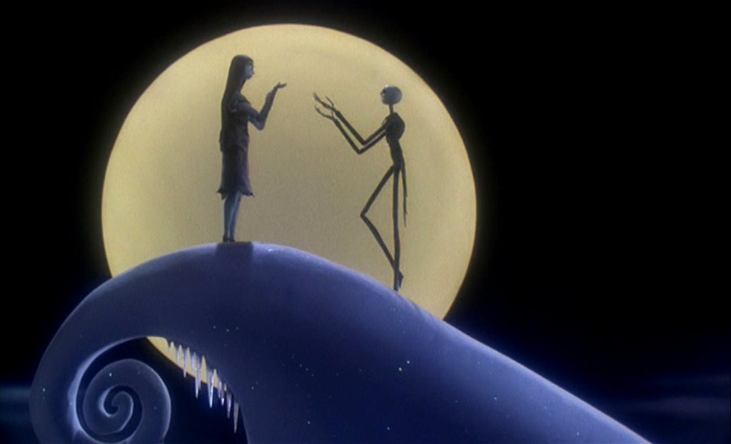
The story finishes by wrapping up the subplot between Jack and Sally leaving us hopeful and satisfied. Due to the spectacular use of storytelling, we return to our own world with the story of Jack, Sally, and Halloween Town forever imprinted in our hearts and minds.

As Halloween night looms, what are your favorite Halloween movies that blend the fundamental storytelling elements of setting, characters, plot, invisibility, mood, and movement to design a world you always return to?

Hierarchy and the Starship Enterprise

Hierarchy deals with the way things are organized to show their importance. The following structures are used to convey this in a visual sense: trees, nests, and stairs. While each structure is viable in its own right, we’re going to focus on nests and stairs, and their application upon the Starship Enterprise.

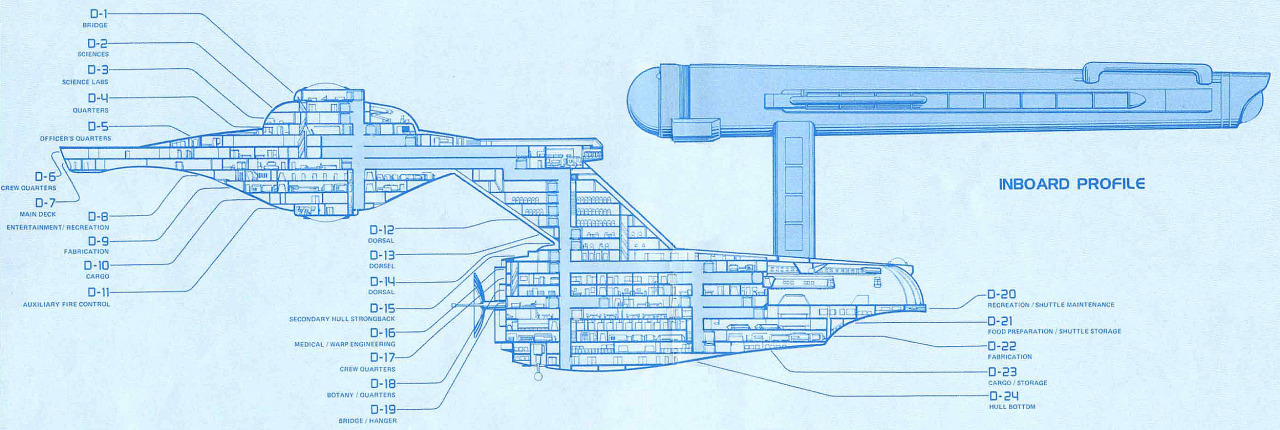
Gaze upon the scientific and design accomplishment that is the Starship Enterprise. Those crisp lines are a wonder to behold. But more design feats exist beyond the surface. Observe closely the saucer section, nestled inside it is the heart of the Enterprise and the lifeblood of the Federation.

Utilizing the nests structure, the Federation was able to create a compact and functional design. Starting at the center of the nests and working our way out we’re able to determine the importance of various sections of the ship. In the center, we have the bridge, where all decisions about the Enterprise and its missions are made and put into action. From there we have the Science centers, Science labs, and Science crew’s quarters. This allows us to determine that science, and the acquiring of further knowledge, was indeed the primary mission of the Enterprise. From there we move to the Officers' and additional crew quarters. The bottom nests, items of less importance, include recreational space and cargo.


While the saucer section makes use of the nests structure, the rest of the Enterprise utilizes the stairs structures. As we move away from the nests, we climb down into the second set of hierarchy on the Enterprise.  Here, the structural integrity of the vessel takes precedence followed by Medical, Botany, and additional crew living space. Rounding out the structure are additional cargo and recreational spaces. Once again showing that things and playtime ranked lower on the priority list for the Enterprise and its inhabitants while their pursuit of knowledge and well-being is classed higher.  


The use of hierarchy gives us insight into how Gene Roddenberry envisioned the future of humanity. With Science and camaraderie taking precedence over the pursuit of worldly possessions.  


What do you think of his hierarchy? Would you change it? And if so, how?


Color and the Starfleet Uniform

"An Imperial Stormtrooper fired at a Redshirt. He missed, and the Redshirt died anyway."

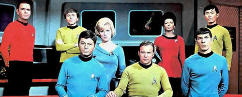
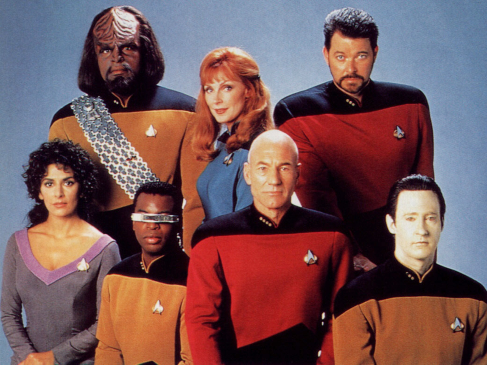
Starfleet utilizes three colors for their uniforms, red, blue, and gold/yellow. These pure primary colors that speak to the mindset of Starfleet. There isn’t time for frills and 80’s neon when you’re hurtling through space at Warp 8. By keeping the uniforms palette simple, Starfleet pays homage to its military roots while showing its bright future with easy to digest pops of color that designate a wearer's career.

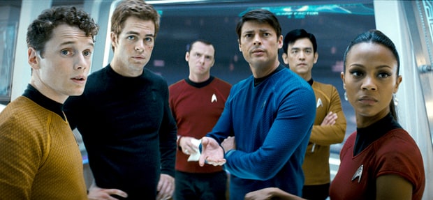
Designating the wearer’s career is the main function of a Starfleet uniform. In TOS (The Original Series) gold was reserved for command, red was for engineering and security, leaving science and medical officers with blue.  After TOS, command swapped with engineering and security while science and medical officers kept their trademark blue threads. We can easily pick out the science officers in a pack of Captains but why those colors for those specific positions?
 

Playing with the psychology of color, the theory that color impacts human behavior, we can get a peek into why Starfleet possibly made the choices it did. Let’s first break down the color meanings:

Red - Aggression, Importance, and Power

Yellow - Caution, Courage, and Inquisitiveness

Blue - Trustworthiness, Reliable, Confidence

Now, taking into account these supposed meanings, it’s easy to determine why command has bounced from red to gold and medical has stayed consistently blue. Crew members know Bones is a reliable doctor, even when he’s not asserting that point to Kirk because they’ve been conditioned to trust the blue uniform he wears.

Redshirts are known for dying frequently, a problem that plagues TOS, and when we consider that red invokes aggression and stands out more it’s easy to see why there are so many dead crewmen on the Enterprise’s roster. When we move to TNG (The Next Generation), we can see that Starfleet learned from this mistake by using a darker shade of red and placing the color on crew members who have roles of power and importance. Shifting the moving targets to officers who can hold their own and limiting the body count.

While security officers enjoy the hesitation their cautious yellow brings on trigger happy hostiles. Further ensuring they don’t become the butt of another away team joke.
 

With its simple color palette, Starfleet honors its roots, boldly goes into the future, lets us rest comfortable in our assumptions about the character of each officer due to the color they’ve earned, and even saves a bit on those all important Federation credits.